- Why Conversions Matter
- Website Conversion Tips That Make a Real Difference
- 1. Make Your Value Proposition Instantly Clear
- 2. Use Strong and Specific Calls to Action
- 3. Reduce Friction in Forms
- 4. Build Trust with Social Proof
- 5. Improve Page Speed and Mobile Experience
- 6. Keep Navigation Simple and Focused
- 7. Match Content to User Intent
- Website Conversion Tips for Better Landing Pages
- 8. Use Visual Hierarchy to Guide Attention
- 9. Test and Optimize Continuously
- Common Mistakes That Hurt Conversions
- Final Thoughts
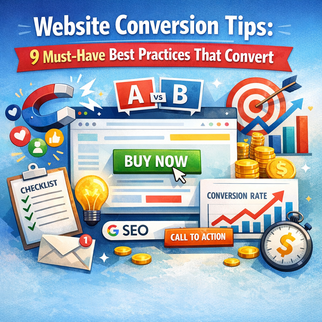
Website Conversion Tips: 9 Must-Have Best Practices That Convert
Website conversion tips are essential for turning casual visitors into subscribers, leads, and paying customers. A beautiful website can attract attention, but design alone does not drive action. If users feel confused, distracted, or unconvinced, they will leave without clicking, signing up, or buying. The good news is that improving conversions does not always require a complete redesign. Often, a few strategic changes can make a major difference.
Whether you run an e-commerce store, service website, blog, or SaaS platform, the goal is the same: make it easier for people to take the next step. Below are nine proven best practices that can help improve performance and create a smoother user journey.
Why Conversions Matter
A conversion happens when a visitor completes a desired action on your website. That action might be making a purchase, filling out a contact form, booking a demo, downloading a guide, or joining your email list.
More traffic is valuable, but traffic without conversions can be costly and unproductive. Improving your conversion rate helps you get more results from the visitors you already have. That means stronger ROI, better lead generation, and more revenue without relying only on increasing ad spend.
Website Conversion Tips That Make a Real Difference
1. Make Your Value Proposition Instantly Clear
When someone lands on your website, they should understand what you offer within seconds. If your message is vague or overly clever, visitors may lose interest before exploring further.
Your value proposition should answer three questions quickly:
– What do you offer?
– Who is it for?
– Why should someone choose you?
Use a strong headline, a short supporting sentence, and a clear call to action above the fold. Avoid industry jargon and focus on benefits rather than features. People want to know how your product or service solves their problem.
2. Use Strong and Specific Calls to Action
A call to action, or CTA, tells visitors what to do next. Generic buttons like “Submit” or “Click Here” often underperform because they lack clarity and motivation.
Instead, use CTA text that communicates value. Examples include:
– Get My Free Quote
– Start Your Free Trial
– Download the Guide
– Book a Consultation
Your CTA should stand out visually and appear in logical places throughout the page. If users have to hunt for the next step, many will simply leave.
3. Reduce Friction in Forms
Long or confusing forms are one of the biggest conversion killers. Every extra field creates more work for the user, and more work often leads to drop-off.
Ask only for the information you truly need. For example, if a name and email are enough to start the relationship, do not request a phone number, company size, and full address immediately.
To improve form conversions:
– Keep fields to a minimum
– Use clear labels
– Add helpful placeholder text if needed
– Show error messages clearly
– Optimize forms for mobile users
The simpler the process, the more likely visitors are to complete it.
4. Build Trust with Social Proof
People are more likely to take action when they see that others have had a positive experience. Social proof reduces uncertainty and helps visitors feel more confident in their decision.
Effective forms of social proof include:
– Customer testimonials
– Star ratings and reviews
– Case studies
– Client logos
– User-generated content
– Trust badges and certifications
Place social proof near CTAs, pricing sections, or signup forms where users may hesitate. A well-timed testimonial can provide the reassurance someone needs to convert.
5. Improve Page Speed and Mobile Experience
A slow website is one of the fastest ways to lose potential conversions. Users expect pages to load quickly, and even a short delay can increase bounce rates.
Page speed matters for both desktop and mobile visitors, but mobile optimization is especially critical. A large share of traffic now comes from smartphones, and a website that looks awkward or loads slowly on mobile can hurt results significantly.
Focus on:
– Compressing images
– Reducing unnecessary scripts
– Using responsive design
– Simplifying mobile navigation
– Making buttons easy to tap
A smooth experience keeps users engaged and makes action feel effortless.
6. Keep Navigation Simple and Focused
Too many choices can overwhelm visitors. If your navigation menu is cluttered or your page contains too many competing links, users may struggle to find what matters most.
Good navigation supports the user journey rather than distracting from it. Keep menus clean, group related pages logically, and highlight the most important actions.
On landing pages especially, limit distractions. In many cases, fewer links and a single primary CTA will outperform a page filled with options. Simplicity helps users move forward with confidence.
7. Match Content to User Intent
Visitors arrive at your website with different goals. Some are researching, some are comparing options, and others are ready to buy. Your content should align with where they are in the decision-making process.
For example:
– Informational blog content works well for top-of-funnel visitors
– Comparison pages help users evaluating options
– Product pages and demos support ready-to-buy visitors
If someone clicks an ad promising a free consultation, the landing page should immediately reinforce that offer. When messaging and user intent are aligned, conversions tend to improve.
Website Conversion Tips for Better Landing Pages
8. Use Visual Hierarchy to Guide Attention
A strong page layout helps users focus on what matters most. Visual hierarchy refers to the way design elements lead the eye through the page.
You can create stronger hierarchy by using:
– Larger headlines for key messages
– Contrasting colors for CTA buttons
– White space to reduce clutter
– Bullet points for scannable information
– Images that support the message rather than distract from it
Visitors do not read every word. They scan. A well-structured page makes important information easy to notice and understand quickly.
9. Test and Optimize Continuously
One of the most important truths about conversion optimization is that there is no single perfect formula. What works for one audience, offer, or website may not work for another. That is why testing matters.
Use A/B testing to compare variations of:
– Headlines
– CTA text
– Button colors
– Images
– Form length
– Page layouts
Also review analytics to identify drop-off points, high-exit pages, and areas where users hesitate. Heatmaps, session recordings, and user feedback can provide valuable insight into behavior.
Small data-driven changes made consistently often produce better results than one major redesign based on guesswork.
Common Mistakes That Hurt Conversions
Even well-designed websites can struggle if they make avoidable mistakes. Watch out for these common issues:
– Unclear messaging
– Weak or hidden CTAs
– Too many pop-ups
– Poor mobile usability
– Slow-loading pages
– Lack of trust signals
– Overly complex checkout or signup process
Identifying and fixing just one or two of these problems can create measurable improvements.
Final Thoughts
Better conversions rarely come from luck. They come from understanding user behavior, removing obstacles, and guiding visitors toward a clear next step. When your website communicates value quickly, builds trust, and makes action easy, you create the conditions for stronger results.
The most effective approach is to start with the fundamentals: clear messaging, simple navigation, fast performance, persuasive CTAs, and ongoing testing. These best practices work across industries because they are rooted in how people make decisions online.
If you want more leads, sales, or signups, focus less on adding more pages and more on improving the experience of the pages you already have. That is where real conversion growth begins.